


Game UI / UX Redesigns
As personal projects, I undertook a series of conceptual redesigns for various game interfaces, focusing on refining a particular aspect of the game's design based on a key phrase or idea. The intent behind these explorations was to reimagine how key UI elements or UX choices could better serve both the game and the player, whether that be through clearer or more accessible navigation, more intuitive interaction, or a change in visual style that enhances or better reflects the identity of the game itself.
Magic: The Gathering
CARD GAME VISUAL REDESIGN
KEYWORD: GALLERY
DATE: 2025


For this project, the goal was to modernize Magic: The Gathering's card frame while fixing UX issues that lend to difficulty reading cards for new players, without without losing the rich fantasy aesthetic that defines the game. Whilst I focused early on improving clarity around mechanics that aren't typically present or obvious, artwork was the primary driving force behind the redesign. Magic’s illustrations are what truly draw players into its worlds, and I wanted the card frame to support that.
The final design is a clean, minimalist one inspired by gallery plaques, in hopes of helping the art sing.
_
All character designs, icon designs and illustrations belong to Wizards of the Coast LLC.
Pokémon Unite
GAME UI / UX REDESIGN
KEYWORD: COMPETITION
DATE: 2025
This UI/UX redesign project focused on visually optimising Pokémon Unite's UI as though it were a competitive title designed for PC like other MOBA games on the market. I aimed to reorganise the system settings and in-match UI to align with modern standards and keep the game screen clean during gameplay at all times, prioritising clarity and general ease of use.
_
All character designs and illustrations belong to The Pokémon Company International, Inc.
click here to view the game's original UI


Guilty Gear: STRIVE
GAME SCREEN UI REDESIGN
KEYWORD: HEAVY METAL
DATE: 2025
A common criticism of Guilty Gear Strive’s match UI is that it isn’t “rock” enough for a series built entirely on metal and attitude. Earlier entries like Xrd and Rev 2 leaned heavily into fiery colours, jagged shapes, and chunky metallic elements, but fans feel Strive’s interface feels muted and empty in comparison. I aimed to strike a balance between Strive’s more minimalist approach and the identity of earlier titles and the series as a whole, pushing the match UI further using visual inspiration from death metal design.
_
All character designs and illustrations belong to Arc System Works Co., Ltd.
click here to view the game's original UI


Granblue Fantasy
GAME UI / UX REDESIGN
KEYWORD: RELINK
DATE: 2025

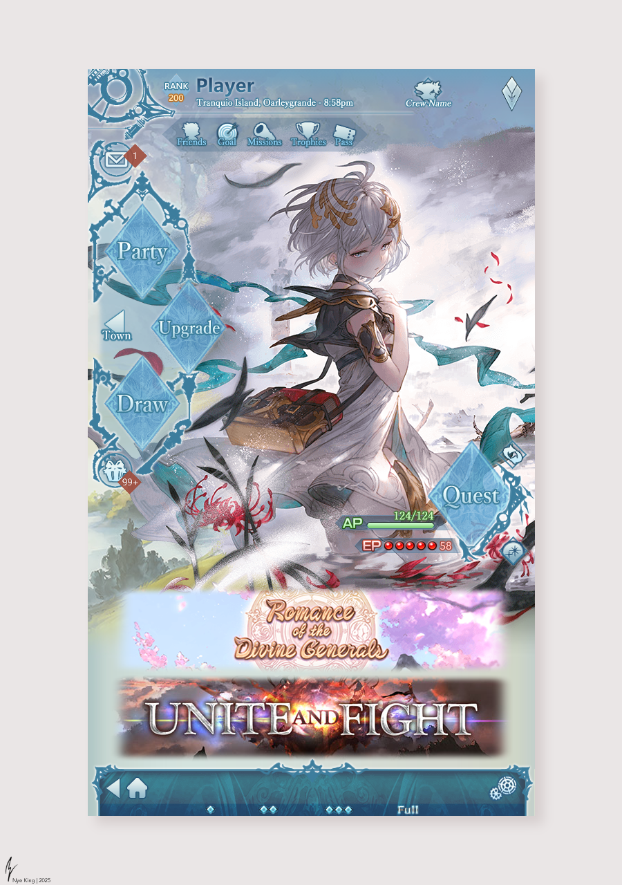

In this project, I tackled Granblue Fantasy's extremely long-standing browser-based interface. My goal was to modernise Granblue’s dense and outdated menu systems while respecting the identity of a game that’s been running for over a decade. I approached the redesign with the franchise's modern action RPG, Granblue Fantasy: Relink, as a visual and UX reference, using its brighter colour palette, cleaner layouts and more modern aesthetic to maintain visual identity. The focus was on simplifying navigation and improving information hierarchy, bringing commonly used elements like class/skill selection to the forefront and giving space to normally deeply nested pages like trophies and trials to improve ease of use for players on top of creating a more contemporary feel that aligns with the modern gacha game space.
_
All character designs and illustrations belong to Cygames, Inc.
click here to view the game's original UI